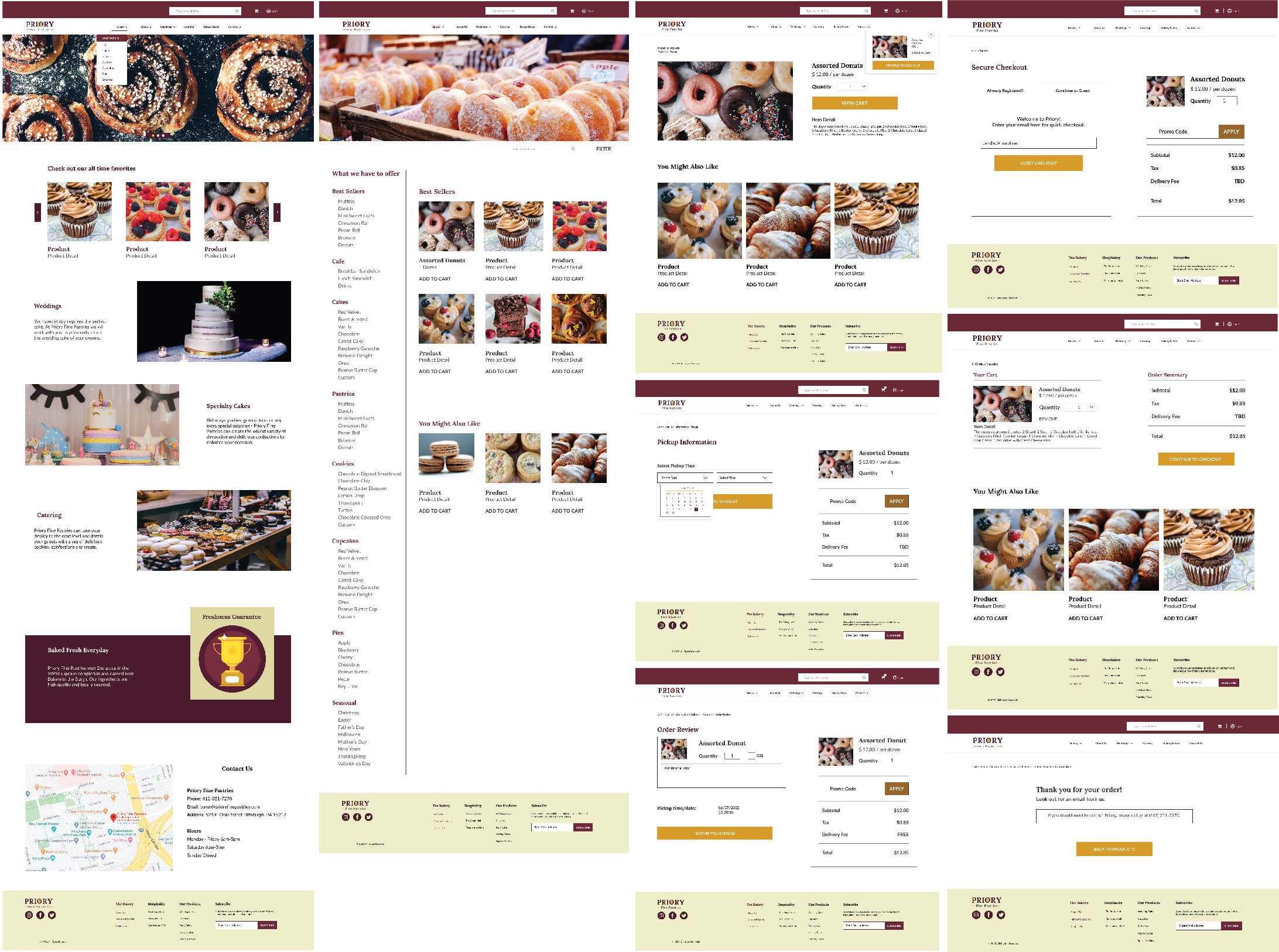
I designed a modern, responsive website for a Pittsburgh, PA-based bakery, an e-commerce website that makes it easy to purchase baked goods online. Have a visually pleasing online presence and spread awareness of products. Establish a way to bring the in-store bakery experience onto a digital platform.
Busy people feel overwhelmed by the number of choices and need a way to order baked goods that is time-efficient and easy to find the products that they are craving or are in the market.
A competitive analysisI was conducted starting with reviewing websites of other bakeries along with their traffic and keyword searches to help identify the strengths and weaknesses of competitors in town.
Competitors Strengths include:
Takeaways:
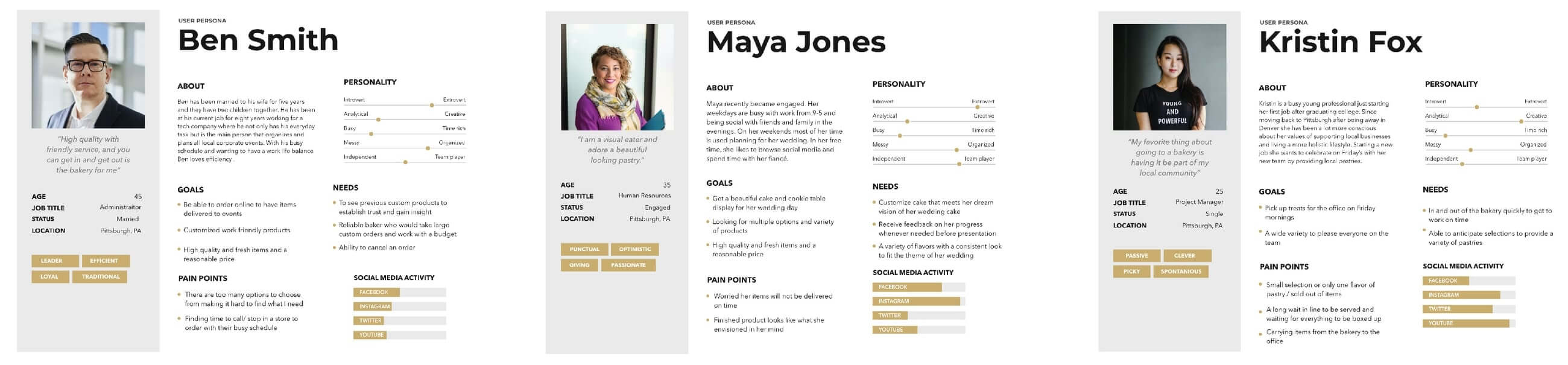
The use of a newsletter could help increase their traffic value. Adding serving suggestions next to their cakes sizes and include their gallery of items within the product page instead of separate navigation. Lastly, have a list of the different flavors and fillings available.User InterviewI sent a survey using google forms to friends, family, and coworkers that consume baked goods on a regular basis. I asked questions like:*Tell me about your last experience at your favorite bakery?*What are some of the things that make you decide to buy baked goods in the store?*Was there anything that frustrated you about your last in-store experience?
Goals:
Pain Points:
User goals and frustrations reflect the data compiled from the surveys. The design for this e-commerce website has the user goals in mind to be met with the site features. Below the user journey wants to purchase a dozen variety of donuts for her co-workers. The goal is to have a seamless user experience the next time she wants to treat her co-workers.
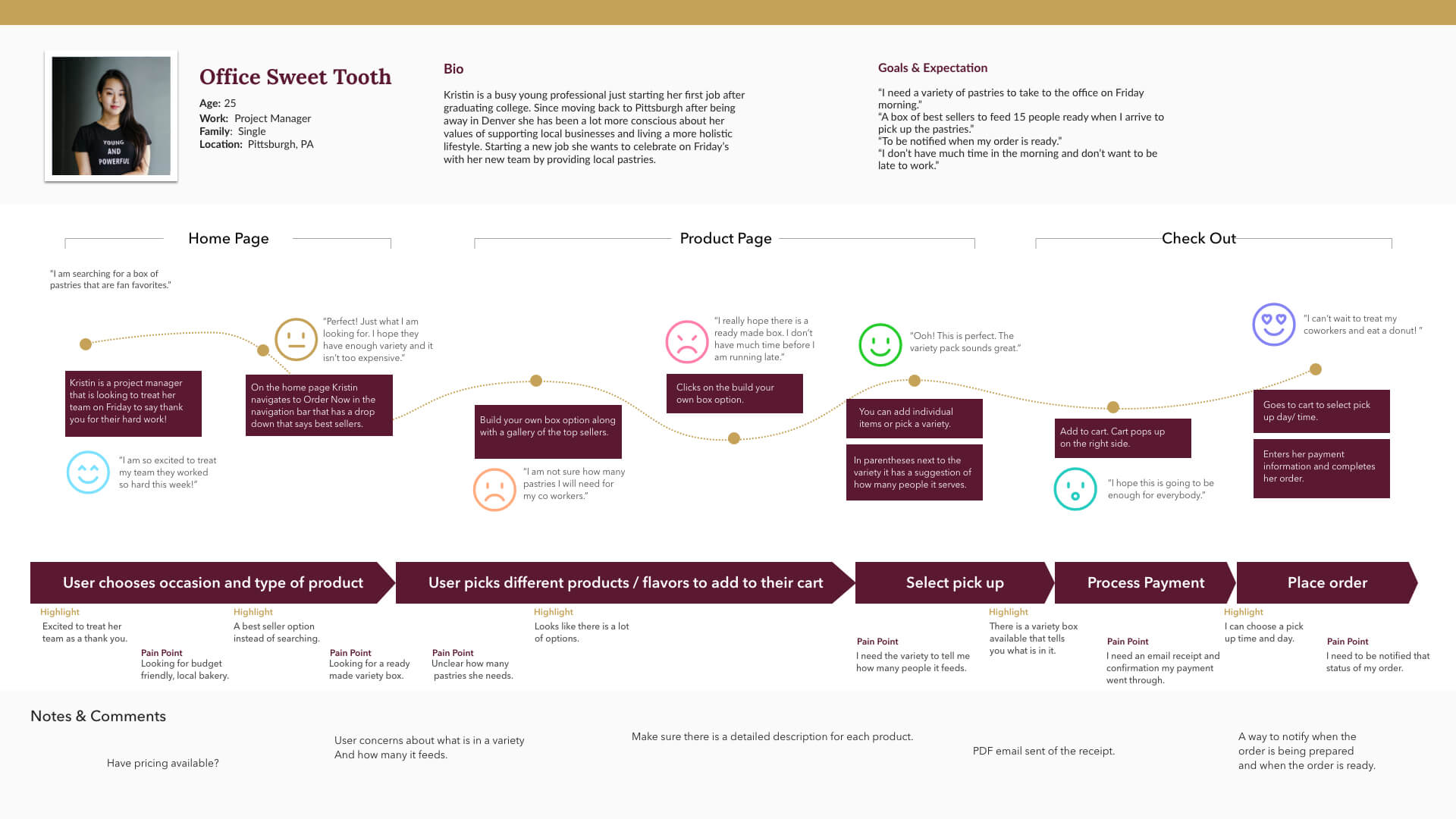
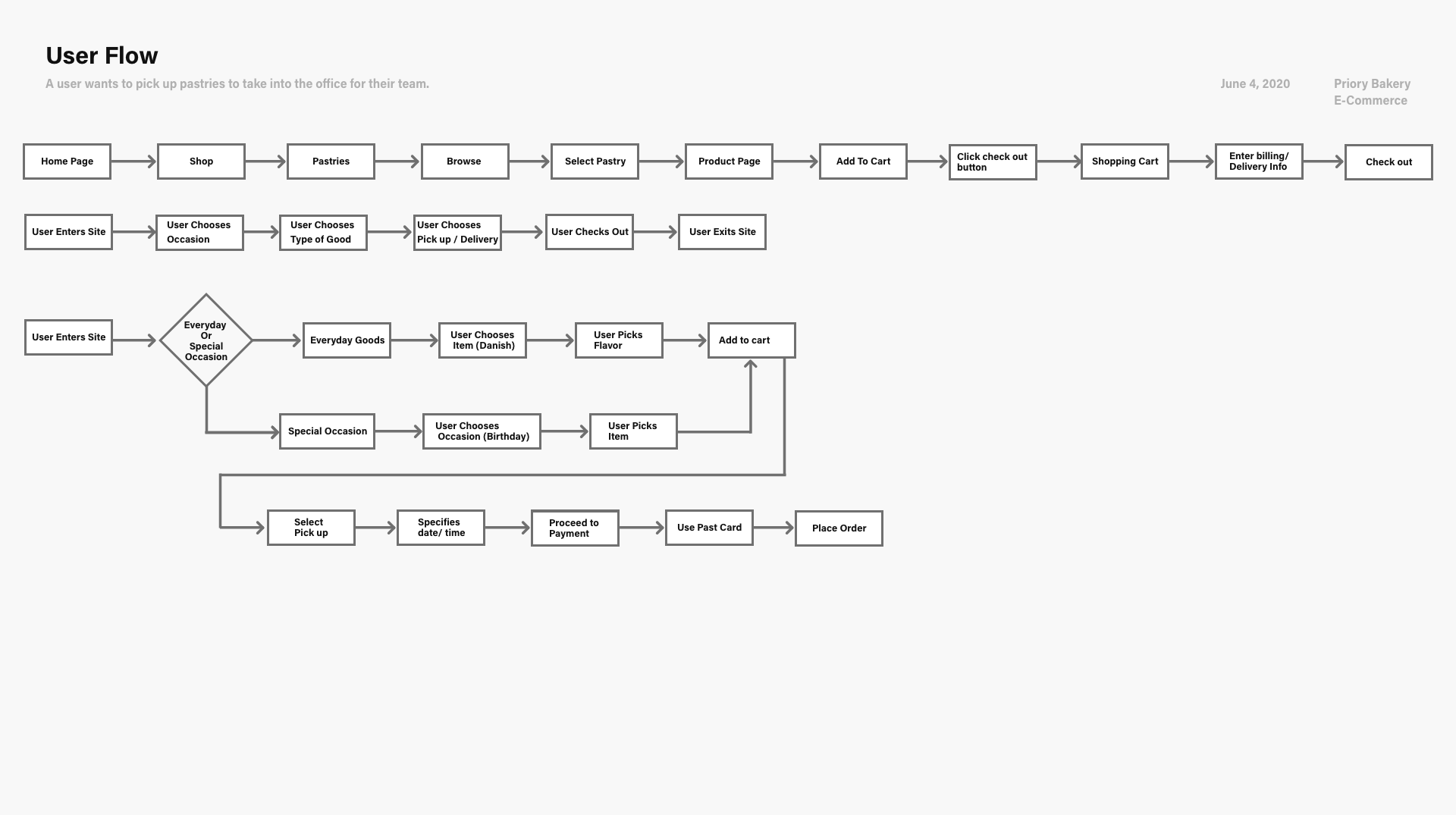
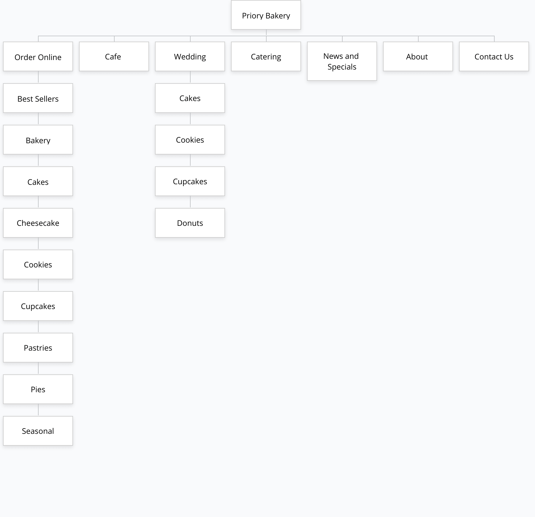
User Flow & Site Map
User flows are created to show the path taken by a prototypical user on the bakeries website to complete a task. I explored some user flows that take them from their entry point through a set of steps towards purchasing a product. Informed by features and priorities outlined in my research, I created a site map to show the information organized based on the hierarchy of content, proposed for the new Priory site.
Call To Action:
Successful Conversion Action:
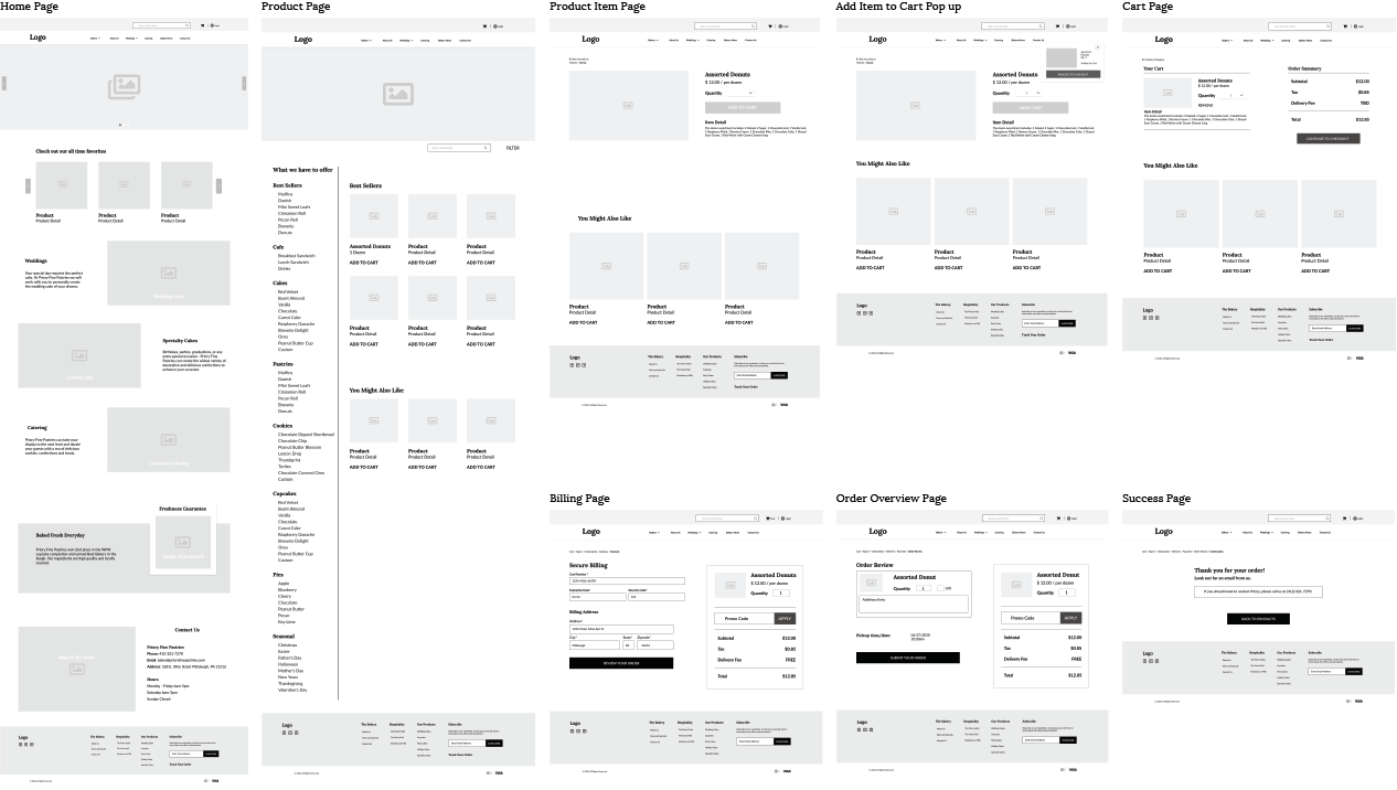
Wireframes
Low fidelity wireframes are developed first based off of the user flows created. Three people who filled out the initial survey took part in testing wireframes.
Feedback :
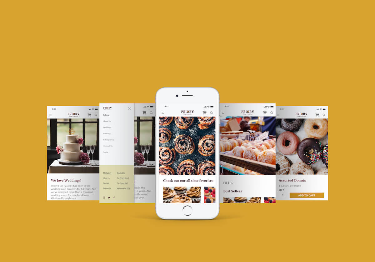
To get a sense for the flow and test experience an interactive prototype was created with the feedback from the wireframe and user goals in mind.
Provide an e-commerce website that makes it easy to purchase baked goods online. Have a visually pleasing online presence and spread awareness of offerings.
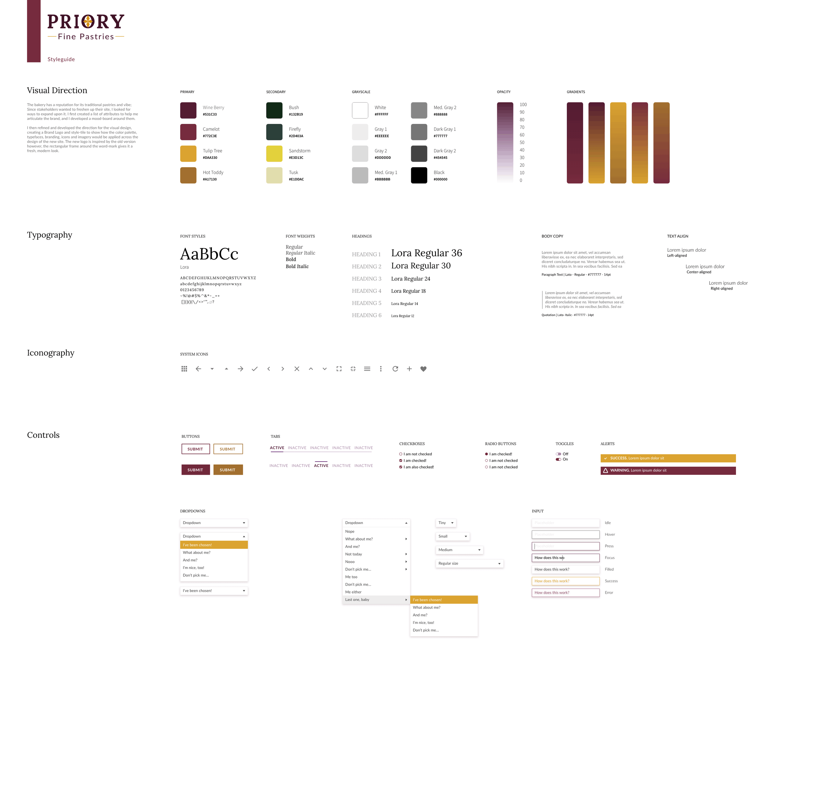
Color and UI style:
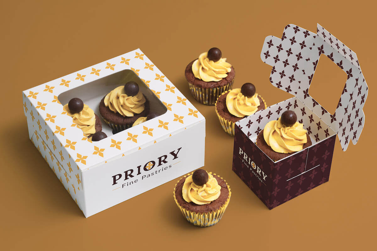
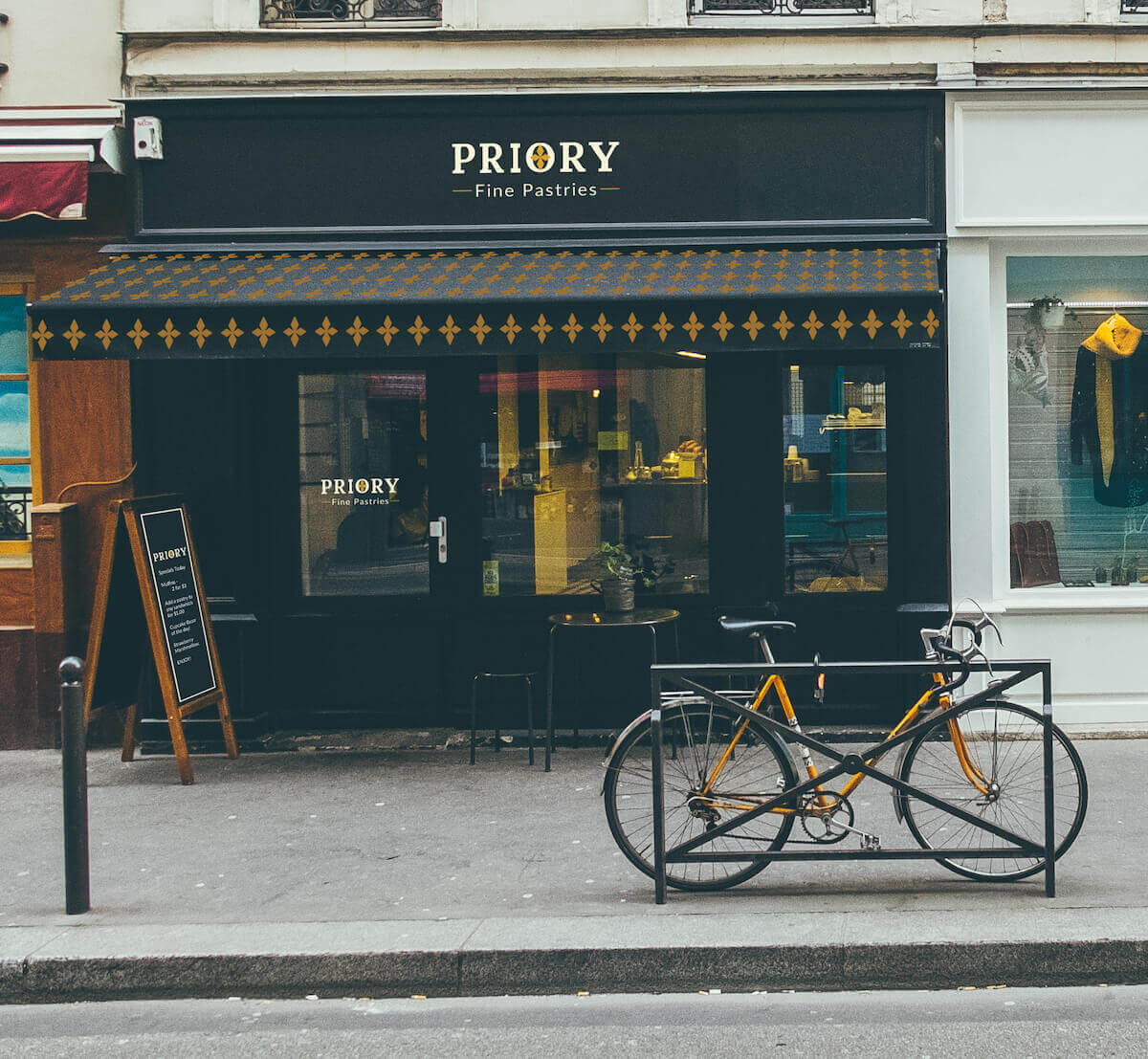
Minimal design with a focus on product photos. Use grids to keep content organized. The overall tone is friendly and elegant to have a balance of attracting locals along with a more high-value purchase like custom cakes for special events. The logo and color scheme was kept from the original logo and made more sophisticated and approachable. The diamond shape in the O of Priory is used repeating as a pattern.
Some Compromises made include: